Allow me to introduce you to StompenSoft, your new go-to sans serif typeface. A font that dances on the fine line between slab and sans-serif like a seasoned ballet dancer. With its sweet soft finishes, geometric grace, short ascenders and descenders that are more tightly led than a secret agent on a covert mission, this typeface is all about adaptability and versatility.
Ready to add this gem to your typography collection? Get your digital hands on StompenSoft by downloading it at YouWorkForThem.
Lowercase Love with StompenSoft
The true beauty of StompenSoft lies in its lowercase characters. We’re talking “i”, “j”, “l”, “r” and the loneliest number, “1”. These little guys rock the slab serif category like they’re headlining a typography festival. They’re the cool kids of the sans-serif block, bringing a unique charm and undeniable appeal to any text they’re a part of.
Playing the Weight Game
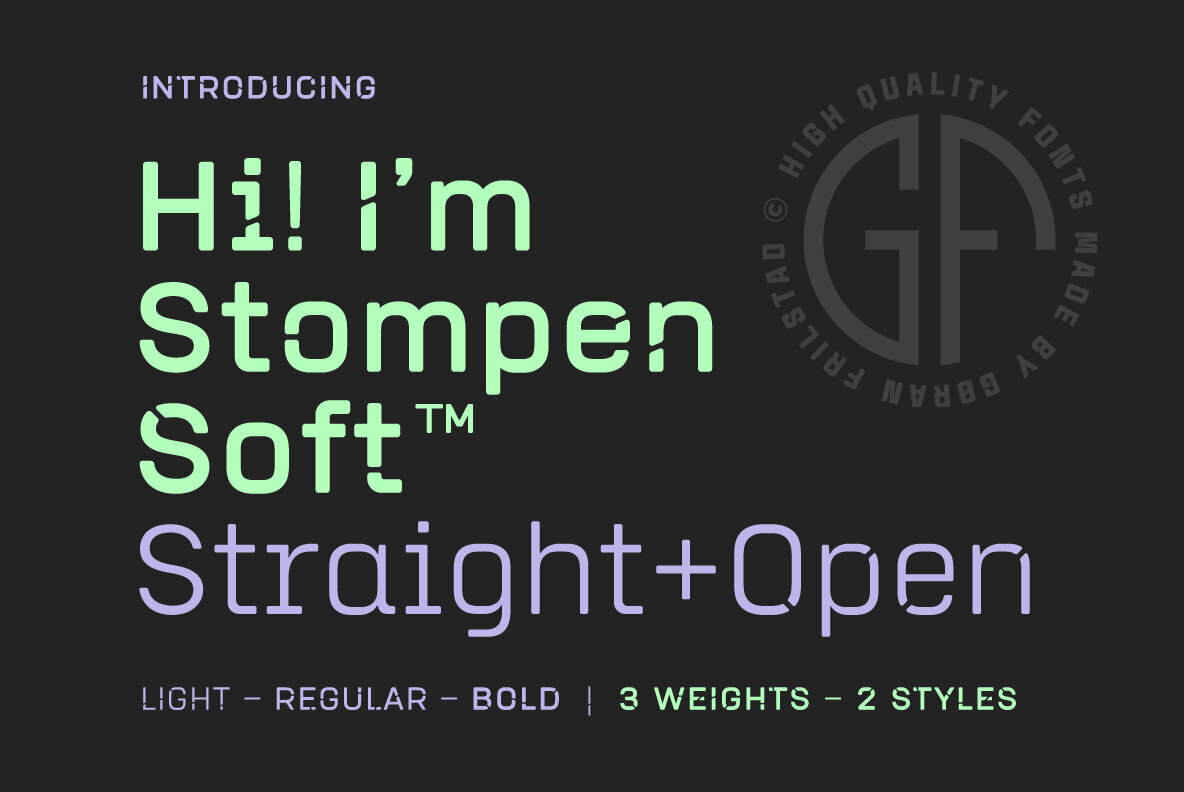
StompenSoft is more than just a pretty face though. It brings three font weights to the table in two different styles – straight and open. It’s like having your cake, eating it, and still having more cake. These weights and styles mix and match like a dream, offering you multiple options for all your graphic design needs.
StompenSoft – A Typeface for all Seasons
StompenSoft doesn’t discriminate. Whether you’re sprucing up a magazine, designing a poster, branding a business or pimping a website, this typeface fits in like a charm. It’s like the chameleon of fonts, able to adapt and enhance any environment it’s placed in. It’s the ultimate tool for anyone looking to create dynamic and impactful designs.
So there you have it – StompenSoft, the typeface that’s making a splash in the design world for all the right reasons. And the best part? It’s waiting for you at YouWorkForThem. So why wait? Embark on your StompenSoft adventure today and see just how much this versatile font can offer.
Remember, in the world of typography, to be different is to be unforgettable. And StompenSoft? Well, it’s a font you won’t soon forget.