If you thought the alphabet was just for kids, then buckle up, Buttercup! We’re about to rock your world with the enchanting art of decorative caps typefaces. These aren’t your Aunt Mildred’s uppercase letters, oh no – these babies are designed with such dizzying skill, you’ll wonder how you ever settled for plain old Arial. Today’s show-stopper is brought to you straight from the wizardry of Vladimir Pavlikov, designed in 2004 and licensed by the good folks at ParaType.
The piece de resistance, my dear readers, can be easily found Download at YouWorkForThem. There, you can download and experience this majestic item in its full glory.
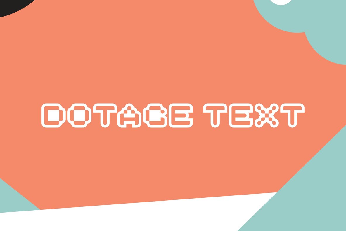
Capabilities and Styles
But let’s dig a little deeper, shall we? What makes this type family so special? Well, for starters, its letterforms are an homage to the low resolution, digital display letters you might have seen at airports, railway stations, and very hipster coffee shops. And it’s not just one single style – oh no, you get Regular, Inline, Shadow Left, and Shadow Right. Think of it as a box of high-end chocolates, each one more delectable than the last.
Additional Features
You thought that was all? Surely, you jest! This font family also comes complete with an additional set of symbols and pictograms. Now you’re not just typing – you’re creating a visual symphony!
The Perfect Setting
Where might one employ such a decorative caps type family, you wonder? Well, it’s a chameleon of the type world. It’s perfectly at home in magazine advertising, posters, in the gritty realm of industrial graphic design, and even the sleek fields of science and technology. This font isn’t just a pretty face; it’s got the strength and versatility to stand up to any design challenge!
So there you have it, lovelies! A font that not only sizzles with style but also comes packed with a universe of features. Now it’s your turn to make magic. The only limit is your imagination! Go forth, download, and create! Remember, the future of graphic design is ‘write’ in your hands!