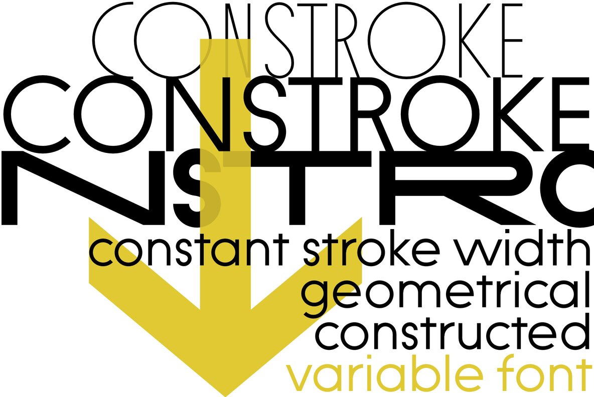
Welcome, dear font enthusiasts, to a whimsical journey exploring a unique, rule-breaking typeface that dares to be different. Feast your eyes on the Constroke font, a strictly geometrically constructed playground where constant stroke width takes center stage. With each character stubbornly geometric, ignoring the ‘good typographical manners,’ you’ll find a delightful blend of quirky charm and rule-defying audacity. It’s a cornucopia of pixel perfection, waiting to adorn your design projects.
Fabulous news folks, you can Download at YouWorkForThem right out of the gate. So, let’s explore this seemingly rebellious typeface, shall we?
Constroke: Going Against the Design Grain
In a world where good rules are revered, Constroke chooses to defy them. Yes, you heard that right. It throws caution to the wind, gleefully ignoring ‘good’ typographical norms. Picture a horizontal line in ‘H’ that’s right smack in the middle, instead of being raised slightly as typographical convention would dictate. The E dashes hold the same length, and rounded shapes are genuinely circular. Constroke plays by its own rules, offering a refreshing perspective on typography.
The Magic of Uniform Stroke Width
Constroke’s magic lies in its uniform stroke width. Notice the delightful spots formed where two lines meet, especially in heavier weights. Examples are abound in characters such as n, m, w etc. The ‘e,’ small yet bullish with its rampant horizontal line, refuses to opt for optical compensation, morphing into a round black dot when viewed from a certain stroke width.
Another trademark feature of Constroke is the round ‘a,’ typical of most geometric fonts. Instead of compensating for the wider appearance of a true circle, Constroke embraces it, lending the font its distinctively chubby letters like a, b, c, d, e, g, o, p, q.
The Winner Takes it All: Extras
Constroke is not just your average geometric font. It comes loaded with stylistic alternates that give it a completely different look. Seven style sets and unusual ligatures beckon, inviting you to play with alternate forms. To sweeten the pot, Constroke also includes tabular figures, circled numerals, and directional arrows. It’s a delightful bag of typographical tricks, waiting to unfold.
And so, we reach the end of our journey through the rule-flouting world of the Constroke font. A world where traditional design constraints were shattered to create something truly unique. If your design thirsts for something daringly different, do download Constroke from YouWorkForThem, and let this quirky geometric typeface add that dash of audacious charm to your work.