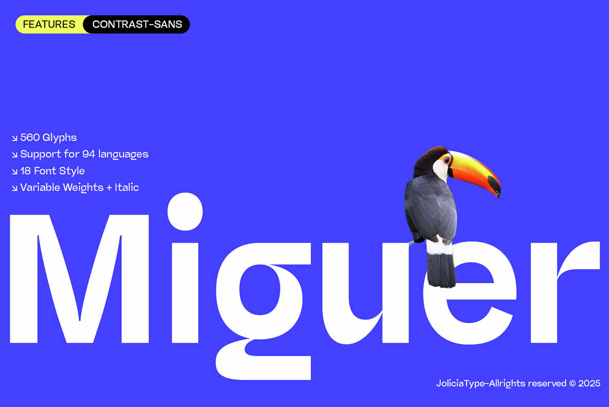
This versatile sans-serif font is brimming with delightful characteristics. Its high contrast creates a striking visual impact that immediately catches the viewer’s attention. The distinctiveness of Miguer Sans lies in its unusual inspiration. Drawing from the shape of a toucan’s beak, this font delivers a unique punch of style that makes it stand out from other, more generic sans-serif typefaces.
Redefining Versatility with Miguer Sans
An exciting roster of 18 styles from Thin to Black, including italics, further catapults Miguer Sans into the annals of design versatility. It allows designers to articulate a wide range of emotions and concepts, from the serious to the whimsical, making it a favourite among creators who love a good typographic challenge. And with a variable font option, you can fine-tune weight and width to create the perfect look for your project.
Focusing on the Fine Print
Miguer Sans is a multilingual powerhouse. With a generous tally of 560 glyphs and support for 94 languages, it is perfect for designers working on international projects. Alternate characters for “R, a, f, g, i, l, t, y” provide room for creative exploration and give the font a playful edge.
Getting Hands-On with Miguer Sans
Ready to dip your design quill into Miguer Sans and start creating your next masterpiece? The font is available for download at YouWorkForThem. Simply follow the [link](https://ywft.us/22857bc5b) and get ready to add some typographic magic to your creations.
Signing Off: Miguer Sans – Your Typeface Toucan
In a design landscape dominated by similar looking sans-serif typefaces, Miguer Sans stands out like a toucan in a flock of pigeons. Its unique design, inspired by the beak of this vibrant bird, gives it a distinct edge, while its versatility makes it a godsend for designers. It is not just another font; it is an invitation to play, experiment, and create designs that leave a lasting impression. So why wait? Give your designs the Miguer Sans treatment today!